What is a brand guide?
A brand guide (also known as brand guidelines, brand style guide, communication guide) is a document that serves as a reference for team members of a company and 3rd parties to keep a brand’s look and core values consistent. The way it looks, feels and sounds.
Have you ever noticed different marketing materials from the same company look a bit off? This is most likely because the brand look and personality is not consistent throughout different communication channels. Successful companies and large corporations have very strict brand standards. For example, a customer’s “journey” from looking at a business card, to searching an Instagram profile and “swiping up” to a website should be completely seamless.
At Venga we try to give our customers all the tools they need to make their brand look, feel and sound professional even after working with them. Take a look at the content and order of a basic Brand Guide.
1. BRAND
At this point, you most likely have been through a “brand identity” process. You know what your company core values are and what you want to communicate to the world. In this first section of your guide you should clearly state what your brand is all about with the following:
- Name of your brand and slogan
- Mission, vision, values
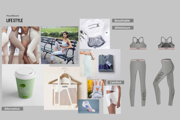
- Moodboard
- Keywords that summarize your company’s inspiration
2. LOGO
A logo is a symbol that will help customers identify your brand. You probably have a few versions of a logo to serve different purposes.
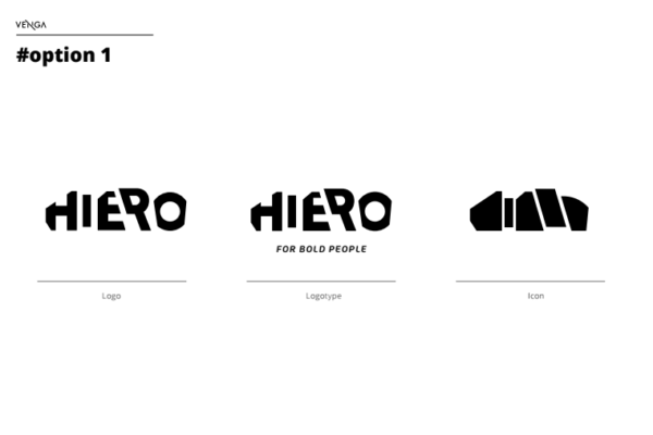
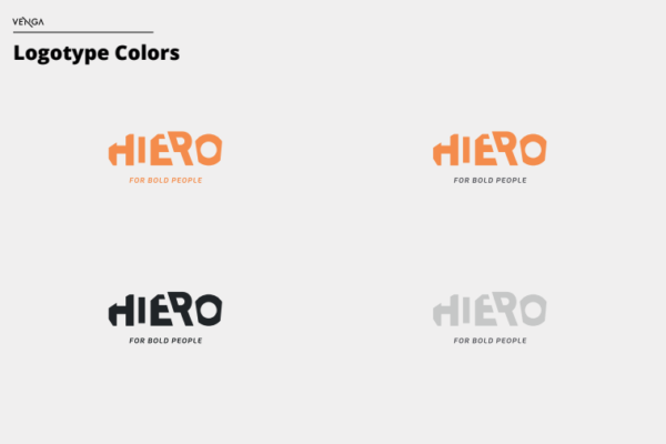
At Venga we identify a logomark as the company symbol alone, a logotype as a symbol made up of letters and a logo as a symbol with the company name. There are also versions in a vertical or horizontal layout, in color and in black and white. Black and white files for example, are very useful for times when you have no control of the background where your logo will be displayed. Here’s what we recommend including:
- Logotype, logomark, slogan
- In black & white and in color
- Minimum size of your logo
- Vertical, horizontal
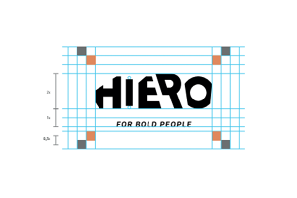
- Exclusion zones
- Correct use, incorrect use
3. COLOR STUDY
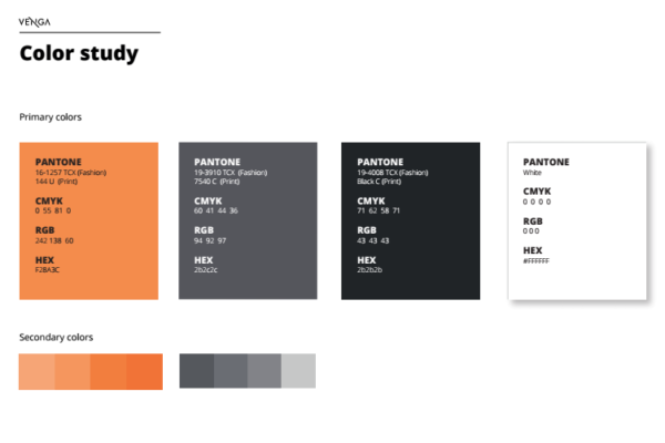
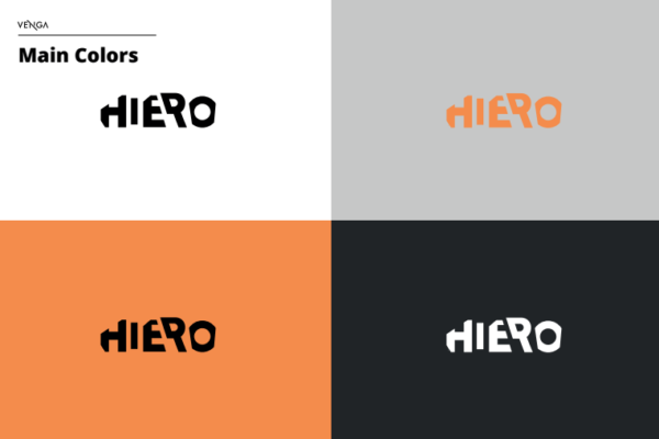
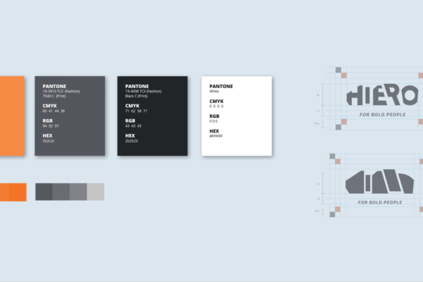
Specify your brand’s main colors in the different color codes and include every logo version. Sometimes your logo color will change depending on the background. Sometimes it is good to note what the correct or incorrect use of your company colors are.
- Include all versions of your logo
- Provide CMYK, HEX, RGB and Pantone codes
- Correct use, incorrect use
4. TYPOGRAPHY
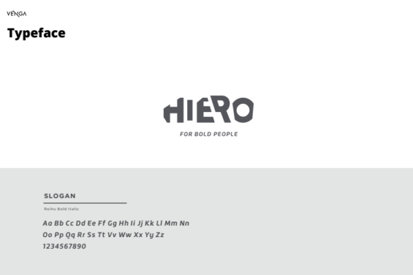
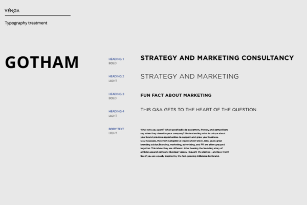
There might be a typography for your logo and a set of typographies for your company’s communication content. Besides your brand’s logo and slogan typography, usually, two font families are chosen for marketing content, website and other communication channels. Make sure to specify what fonts will be used for what purposes: headlines, paragraphs, quotes…
- Specify the font family
- Primary and secondary
- Typography for logo and for all other applicaitons
5. LOOK & FEEL
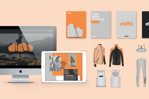
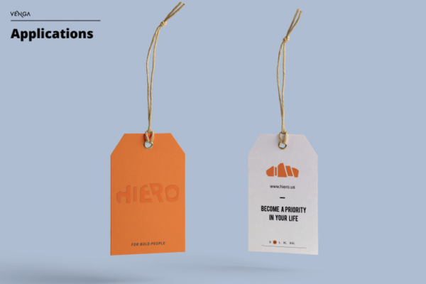
This section is destined for image examples and mock ups of your brand’s touch points. Website look & feel or physical assets could be part of this section.
- Examples of photos go with the feel of your brand
- Digital and Physical asset applications: website, social media, newsletters, flyers, business cards…
